Axes
Tecplot 360 automatically enables axes for 3D, 2D, XY, and Polar plot types. There are five distinct sets of axes, one for each plot type. When axes are generated, axis labels, positions, spacing, and tick labels are created. You can adjust these settings through thedialog (accessed via themenu).Each page of the dialog controls a different aspect of the axes, and each page is available for every axis.
Axis Display
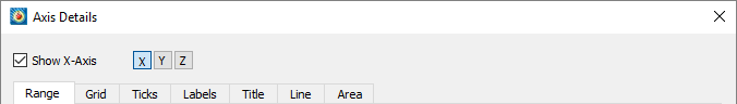
Use the"Show Axis" toggle in the dialog to turn on axis display. By default, showing an axis displays the axis line, tick marks, tick labels, and axis title. You can individually disable any of these components, including the axis line.
To edit an axis from thedialog, use the axis buttons ([X], [Y], [R], etc.) at the top of the dialog to indicate which axis you are working on. To edit a different axis, select a different axis button.
Axis Variable Assignment
For 2D and 3D Cartesian plots, Tecplot 360 initially assigns the first and second variables in the data set to the X and Y axes, respectively. For 3D axes, the third variable in the data set is assigned to the Z axis.
To change the variable assignment for 2D and 3D axes, select "Assign XY" or "Assign XYZ" from themenu. For line plots, assigning axis variables is part of defining a mapping. For more information, seeXY and Polar Line Plots。
You can modify the axis range using the"Range" page of the dialog, which can be accessed via themenu, or by right-clicking on an axis in the plot. SeeAxis Range Options for XY and 2D/3D Plots和Axis Range Options for Polar Plots
。
- When working with axis ranges, keep the following definitions in mind:
-
Axis Range
- Specifies the minimum and maximum data values displayed along the axis. The axis range fits the values of the first variable assigned to that axis. If you deactivate the current layer and activate another, you may need to reset the axis range.
-
Axis Length
- Axis Scaling
-
Specifies the ratio of axis length to axis range.
Axis range options for XY plots and 2D/3D plots
This section discusses the options available on the "Range" page for XY line plots, 2D Cartesian plots, and 3D Cartesian plots, located in thedialog.
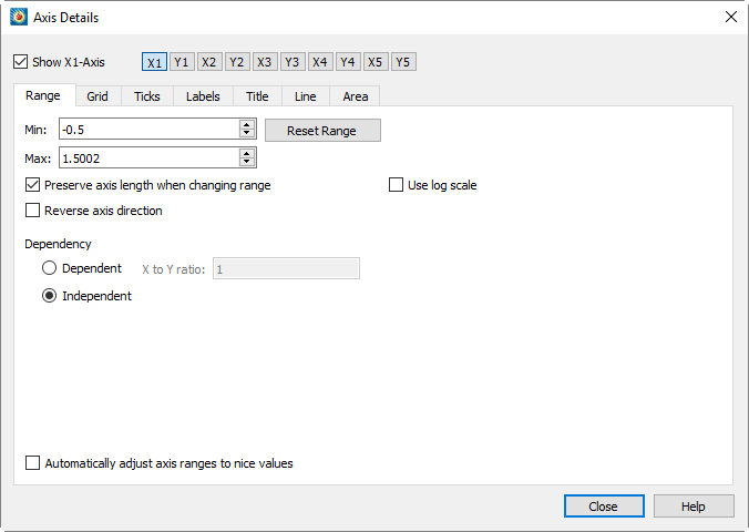
The "Range" page contains the following options:
-
Check this checkbox to display the selected axis in the plot (n). Use the [X], [Y], etc. buttons to the right of this checkbox to select the axis to display.
-
Enter the minimum value of the axis range.
-
Enter the maximum value of the axis range.
-
Reset by selecting one of the following three options from the dropdown menu and fields:
-
Set the range slightly larger than the current axis variable range so that the axis starts and ends at major tick increments.
-
Set the range to the variable minimum and maximum values, taking blanking effects into account.
-
Round the axis range to the nearest major tick increment.
-
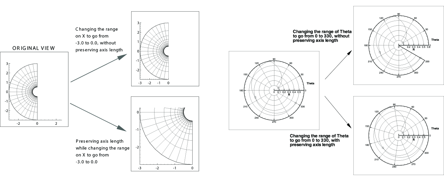
If this option is enabled and the axis is set to "Independent", changes to the X/Y ratio will affect the axis range but not its scaling. Disable this option to change both the axis range and axis scaling. SeeFigure 1.
-
The X and Y axes of 2D or XY line plots can use linear scaling (default) or logarithmic scaling. When logarithmic scaling is selected and "Auto Spacing" is enabled, large numbers will be displayed in scientific notation (e.g., 3.48x10⁵). It is strongly recommended to use "Auto Spacing" on logarithmic axes. Navigate to the "Ticks" or "Labels" page of the dialog and enable "Auto Spacing" to use this option.
-
Enable this option to display the axis from high to low instead of low to high. Not applicable to 3D Cartesian plots.
-
Select whether to set the axes as interdependent or independent. For XY line plots or 2D Cartesian plots, choose "Independent" or "Dependent".
When an XY line plot uses logarithmic scaling, the axes must be set to independent. For 3D Cartesian plots, choose from the following options:
-
All axes are independent.
-
The X and Y axes are interdependent, and the Z axis is independent.
-
Changing the scaling of any axis will cause the other two axes to scale proportionally, maintaining the specified X/Y ratio and X/Z ratio.
-
- 2D Plot
-
If "Dependent" is selected, enter the ratio of X to Y.
- 3D Plots
-
If XY Dependence is selected, enter the ratio of X to Y.
- 3D Plots
-
If XYZ Dependence is selected, enter the ratio of X to Y and the ratio of X to Z.
-
Automatically adjust the axis range to the nearest major axis increment.
-
If the axis is XY dependent, changing the X or Y size factor changes the other. If the axis is XYZ dependent, changing one size factor changes the other two.
-
Reset the dependence controls to their default values.
Axis range options for polar plots
Polar axes differ from any other axis type due to their cyclic nature. Each polar axis (Theta and R) has very different settings, unlike XY or XYZ axes. For the Theta axis, you can change the Theta mode, Theta period, and Theta values on the right circle; for the R axis, you can change the origin; for both axes, you can clip data to the axis range.
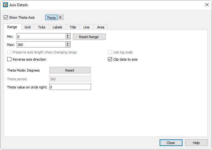
- Show Axis
-
Check this checkbox to display the selected axis on the plot. Use the Theta, R, etc. buttons to the right of this checkbox to select the axis.
- Minimum
-
输入轴范围的最小值。
- Maximum
-
输入轴范围的最大值。
- Reset Range
-
重置 and Set the field by selecting one of three options from the dropdown menu.
- Reset to Full Circle
-
Set the Theta range to cover the entire circle.
- Reset to Fit
-
Set the range to be slightly larger than the current axis variable range, so that the axis starts and ends at major axis increments.
- Set to Variable Min/Max
-
Set the range to the variable minimum and maximum values.
- Fit Current Values
-
将轴范围舍入到最近的主轴增量。
- 更改范围时保持长度
-
如果勾选,对 Theta 与 R 比率的更改将影响轴范围,但不影响其比例。取消勾选可同时更改轴范围和轴比例。请参阅Figure 1有关差异的图示。
- 使用对数刻度
-
R轴可采用线性刻度(默认)或对数刻度。当选择"自动间距"配合对数刻度时,大数值将以科学计数法显示(例如3.48x10)。5强烈建议在对数轴上使用"自动间距"。导航至对话框的"刻度"或"标签"页面,并启用"自动间距"以使用此选项。
- 反转轴方向
-
启用后,轴将从高到低显示,而非从低到高。不适用于3D笛卡尔图。
- 将数据裁剪至轴范围
-
对于极坐标折线图,数据可能超出轴边界。使用此功能可消除绘制在轴范围之外的数据。裁剪数据可针对每个轴独立设置。要激活或停用裁剪,请切换"将数据裁剪至轴范围"的开启或关闭状态。此功能图示见Figure 2.
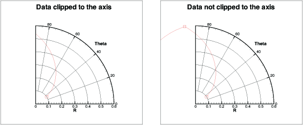 Figure 2. An example of clipping polar data to an axis.
 - Theta模式
-
默认情况下,Theta轴以角度模式表示,范围为0到360。对于Theta轴,您可以使用弧度、角度或任意单位(其中任意模式将Theta范围设置为Theta轴变量的最大值和最小值)绘制角度。
要设置Theta模式,请从以下选项中选择:
-
0 - 360度
-
-180至180度
-
0至2Pi弧度
-
Pi至Pi弧度
-
适配变量最小值/最大值
选择任一选项将更改Theta模式、重置Theta轴范围并重置Theta周期。当Theta模式为弧度时,Tecplot 360将Theta标签显示为Pi的分数单位。
-
- Theta周期
-
Theta周期指定形成完整圆所需的Theta范围。如果Theta模式为"角度",则Theta周期强制为360;若为"弧度",则周期为2 Pi;若为"适配变量最小值/最大值",则周期可设置为任意值。
- 圆右侧的Theta值
-
"圆右侧的Theta值"设置可更改Theta轴的方向。默认情况下,此值为零,即零值(或等效值,如360度、720度等)显示在圆的右侧。您可更改此值以调整轴的方向。
- R原点
-
R origin specifies the R value represented by the axis center. The effect of changing the R origin is displayed inFigure 3.
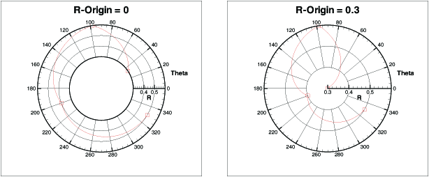 Figure 3. An example of changing the R-origin from a range of 0.3 to 0.6 on a polar plot.
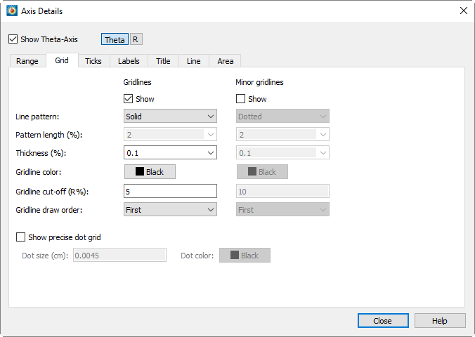
Axis Grid Options
You can control grid lines and minor grid lines via the "Grid" page.dialog, as shown below. On this page, you can customize the line type, line type length, line thickness, and grid line color for grid lines and minor grid lines.
-
Match the spacing of tick marks.
-
Number of subdivisions for grid lines.
The spacing of grid lines is controlled by tick mark spacing; for more information, seeTick Mark OptionsRelated topics.
-
To activate grid lines or minor grid lines, enable the "Show" option under these headings on the "Grid" page. Both types of grid lines have the following options:
-
Select one of the following line types from the "Line Type" dropdown menu: Solid, Dashed, Dash-Dot, Dotted, Long Dash, or Double Dash-Dot.
-
(Theta axis only) Select the line type length from the dropdown menu, or enter a custom value.
-
Select the line thickness from the dropdown menu, or enter a percentage value relative to the frame height.
-
Use the color picker to select the grid line color.
-
Except for 3D axes, all axes allow specifying the drawing order of grid lines. Grid lines can be drawn first (behind all other plot layers) or last (overlaying all plot layers).
-
(Theta axis only) Select the point along the R axis where Theta lines stop drawing.
In polar line plots, excessive grid lines in the central area may obscure data. You can specify the cutoff position of grid lines along the R axis for polar plots on the"Grid" page of the dialog.
-
Minor grid point grid is a set of small dots drawn at each minor grid line intersection. In line plots, the first valid mapped axis assignment controls the minor grid point grid. When either axis of the first valid line mapping uses a logarithmic scale, the minor grid point grid option is disabled for 3D Cartesian plots and line plots.
Tick Mark Options
Tick marks can be placed on each axis and labeled with numbers or text strings. You can use the"Tick" page of the dialog to define tick marks and their positions. You can use the dialog.
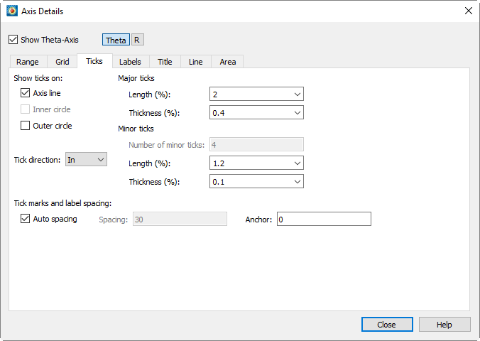
-
"Label" page of the dialog to define tick mark labels. For each plot type, you can display tick marks on different parts of the axis. (This description also applies to labels and titles.)
Sketch, XY line plots, and 2D Cartesian axes allow displaying tick marks in the following areas:
-
Represents the line of the specified axis.
-
By default, the axis line is located at the left/bottom of the grid border. The bottom of the grid border is the lower-left corner position of the grid, defined by dialog.
-
the viewport settings on the "Region" page of the dialog. The top of the grid border is the upper-right corner position of the grid, defined by dialog.
the viewport settings on the "Region" page of the dialog. Tick marks for 3D Cartesian axes can be displayed in the following areas:
-
The line that represents the specified axis.
-
The complementary line opposite to the axis.
Tick marks for the Polar R axis can be displayed in the following areas:
-
The line that represents the R axis.
-
Available only when "Draw Axis on Both Sides" or "Draw Perpendicular Axis" is enabled for the R axis. When the "All R Axes" setting is enabled, tick marks will be displayed on the additionally drawn axes.
-
The starting point of the polar grid region.
-
The ending point of the polar grid region.
Grid boundary start and grid boundary end are available only when the polar plot does not form a complete circle. If the data forms a complete circle, there is no start or end point on which to draw tick marks.
Tick marks for the Polar Theta axis can be displayed in the following areas:
-
The line that represents the Theta axis.
-
Available only when the R axis minimum (Min) is greater than the R axis origin (Max) value. The minimum and maximum values are located onthe "Range" page of the dialog (seeAxis Range Options for Polar Plots). In this case, the center of the polar plot is a circle rather than a single point, so tick marks can be drawn on the inner circle.
-
The outer edge of the polar grid region.
-
The length and thickness of major and minor tick marks can be set independently via the "Length" and "Thickness" fields.
-
To specify the number of minor tick marks, first turn off "Auto Spacing" at the bottom of the page. The number of minor tick marks can be set in the "Number of Minor Tick Marks" text field in the "Minor Tick Marks" section of the dialog, along with adjustments to their length and thickness.
There is no independent control option for displaying minor tick marks. To hide minor tick marks, enter 0 in the "Number of Minor Tick Marks" text field. -
You can directly control the spacing between tick marks and labels, or use "Auto Spacing" (default) to calculate the optimal spacing. When the view changes (especially during zooming), Tecplot 360 recalculates the spacing. When "Auto Spacing" is enabled, Tecplot 360 also automatically calculates the number of minor tick marks.
The spacing value is shared between tick marks and tick labels. You can modify the spacing by adjusting the auto spacing, spacing, and anchor controls under "Tick Mark and Label Spacing" at the bottom of the page.
Tick Mark Label Options
Throughthe "Labels" page of the dialog, you can specify label attributes for each axis's tick marks.
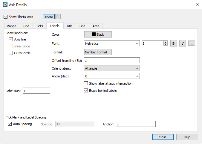
-
Depending on the plot type, the corresponding label display options are enabled.
For Sketch, XY Line, and 2D Cartesian Line plots, you can choose:
-
When toggled-on, axis labels will display on the selected axis line.
-
When toggled-on, axis labels will display at the bottom of the grid.
-
When toggled-on, axis labels will display at the top of the grid.
For 3D Cartesian Line plots, choose from the following options:
-
When toggled-on, axis labels will display on the selected axis line.
-
When toggled-on, axis labels will display on the opposite edge of the plot.
For Polar Line plots, choose from the following options:
-
When toggled-on, axis labels will display on the selected axis line.
-
When toggled-on, axis labels will display on the inner edge of the polar grid area. (Available only when the R-axis minimum is greater than the R-origin value.)
-
When toggled-on, axis labels will display on the outer edge of the polar grid area.
-
Select the color and font for label display. (SeeFont Folders and Fallbackfor how fonts work in Tecplot 360.)
-
Use the "Specify Number Format" dialog to select the number format for axis labels.
-
Enter the offset of tick labels relative to the axis.
-
Choose from the following additional label display options:
-
Labels oriented at a specified angledropdown menu.
-
Labels are parallel to the axis.
-
Labels are perpendicular to the axis.
-
If "Orient Labels" is set to "By Angle", specify the orientation of tick labels relative to the axis. The angle is measured counterclockwise from the axis (in degrees).
-
[2D, XY, and Polar only] - When toggled-on, labels are drawn at the intersection of the two axes. Use this switch when axis labels collide or stack at the intersection.
-
When toggled-on, a rectangle (using the frame background color) is added behind the labels to enhance label visibility.
-
Specify the interval between tick labels.
-
You can directly control the spacing of ticks and tick labels, or use automatic spacing (default) to calculate the optimal spacing for ticks and tick labels. When you change the view (especially when zooming), Tecplot 360 recalculates the spacing. When automatic spacing is selected, Tecplot 360 also automatically calculates the number of minor ticks.
间距值在刻度和刻度标签之间共享。您可以通过调整 dialog.
Use the Auto Spacing, Spacing, and Anchor controls at the bottom of the Scale or Labels page of the dialog to change the spacing.
坐标轴标题是标识坐标轴的文本标签。默认情况下,Tecplot 360使用分配给该坐标轴的变量名称来标记每个坐标轴。
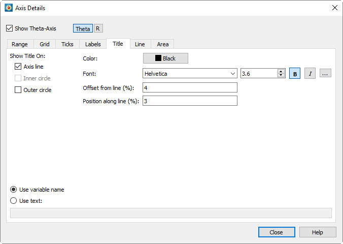
通过在对话框的"Title"页面,您可以为每个坐标轴标题指定以下属性:
-
对于任何绘图类型,您可以指定坐标轴标题的显示位置。启用"At Axis Line"可将标题直接显示在对应坐标轴上。其余可用选项取决于绘图类型。
- 适用于三维
-
Opposite Side
- 适用于二维的XY线或草图
-
Bottom of Grid Boundary 或 Top of Grid Boundary
- 适用于极坐标线图
-
Inner Circle 或 Outer Circle
-
选择您希望坐标轴显示的颜色和字体。(参见Font Folders and Fallback for more information on how fonts work with Tecplot 360.)
-
防止Tecplot 360将坐标轴标题直接打印在坐标轴上。您可以指定从坐标轴一侧或另一侧的正负偏移量。偏移量为零时,坐标轴标题边缘将紧贴坐标轴打印。
您也可以使用工具栏中的调整器
 工具调整坐标轴标题偏移量(不适用于三维笛卡尔图)。
 -
指定坐标轴标题的起始位置,以坐标轴长度的百分比表示。
-
选择以下显示选项之一:
-
图例标题将显示分配给等高线组的变量名称。
-
图例标题将显示在选项控件旁文本字段中输入的文字。该文字可包含动态文本(参见Dynamic Text了解动态文本信息),并使用Text Details标签进行格式化(参见文本格式化标签信息)。
Axis Options
默认情况下,只要坐标轴显示,实际坐标轴线就会显示。但是,您可以在不关闭整个坐标轴的情况下隐藏坐标轴线。要显示或隐藏坐标轴线,请选择 dialog (accessed via the The "Lines" page in the menu.
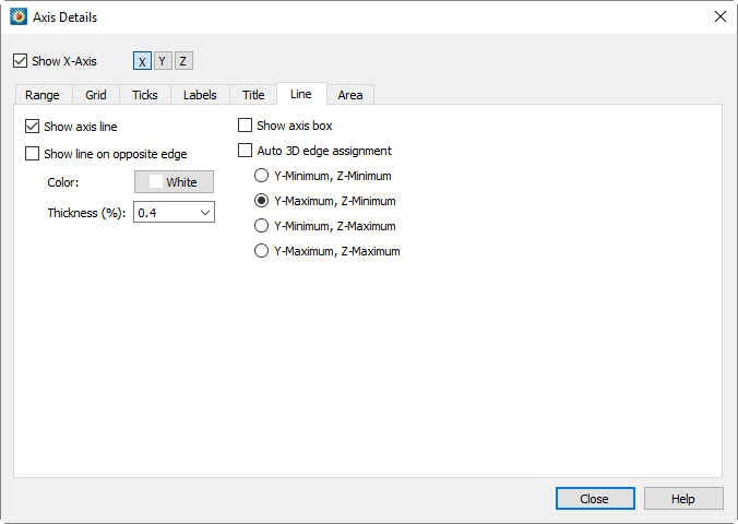
The options in this dialog vary by plot type, and for some plot types, also depend on the selected axis. The following describes all available options, but not all options are available at all times.
-
Toggle on or off to show or hide the axis line.
-
Use the color picker to select the color of the axis line.
-
Select the thickness of the axis line.
-
(3D Cartesian plots only) - Toggle on or off to draw a line on the opposite side of the selected axis line.
-
Turn on Grid Border to draw a border around the grid. Toggle on or off to show or hide the grid border. Not applicable to 3D Cartesian plots.
-
Select the color of the grid border.
-
Select the thickness of the grid border.
-
Select the part of the plot area to align the axis to. Not applicable to 3D Cartesian plots.
For Sketch, XY Line, and 2D Cartesian plots, choose from the following options:, , , or. If "Axis Value" (e.g., Y Value) is selected, enter the desired value in the text field. If "Bottom" or "Top" is selected, enter the offset relative to the bottom or top. If "Viewport" is selected, enter the position within the viewport.
For Polar plots (Theta axis), choose from the following options:, , or . When aligning with the R value, enter the R axis value to specify the position of the axis line. When aligning with the inner or outer circle, specify the offset. An offset of zero places the axis line on the inner or outer circle; a positive offset moves the axis line outside the grid area; a negative offset moves the axis line inside the grid area.
For Polar plots (R axis), choose from the following options:, , or . When aligning with the Theta value, enter the Theta axis value to specify the position of the axis line. When aligning with the inner or outer circle, specify the offset. An offset of zero places the axis line on the inner or outer circle; a positive offset moves the axis line outside the grid area; a negative offset moves the axis line inside the grid area.
-
Align the R axis with a specific Theta value. The axis is confined within the grid area.
-
Align the R axis with the start of the grid border. The axis is confined within the grid area.
-
Align the R axis with the end of the grid border. The axis is confined within the grid area.
-
Align the R axis with a specific screen angle. The axis is confined within the grid area.
-
Align the R axis with the top of the grid area. The axis can be drawn outside the grid area.
-
Align the R axis with the bottom of the grid area. The axis can be drawn outside the grid area.
-
Align the R axis with the left side of the grid area. The axis can be drawn outside the grid area.
-
Align the R-axis to the right side of the grid area. The axis can be drawn outside the grid area.
-
Specify the Theta axis value to determine the position of the axis line.
-
Enter the offset of the line relative to the coordinate axis.
-
Enter the angle of the line relative to the coordinate axis.
-
In addition to setting the R-axis alignment, you can also choose to draw an axis line perpendicular or parallel to an existing axis line to extend the R-axis.
Enable "Draw Axis in Both Directions" to extend the axis line so that it spans the width of the grid area.
-
Enable "Draw Perpendicular Axis" to draw an axis line perpendicular to the main axis line.
-
(Polar Line plots only) Enable "Show Viewport Border" to display the viewport border. The viewport border is defined on the "Area" page. dialog.
-
Select the color of the viewport border.
-
Select the thickness of the viewport border.
-
(3D Cartesian only) - When enabled, the axis line will be displayed on the opposite edge of the plot.
-
选择网格边框的颜色。
-
选择网格边框的粗细。
-
(3D Cartesian only) Enable "Show Axis Box" to display all edges of all axes.
-
(3D Cartesian only) - Enable "Auto 3D Edge Assignment" to place the three axes so that they do not interfere with the drawing of the plot. If disabled, you can choose to place the line on any pair of edges, such as Y-Minimum and Z-Minimum, Y-Maximum and Z-Minimum, Y-Minimum and Z-Maximum, or Y-Maximum and Z-Maximum. The available pairs depend on the axis selected for editing.
Grid Area Options
The grid area of a plot is the area defined by the axes. Throughthe "Area" page, you can control whether the grid area or viewport is filled with color. The "Area" page is shown below.
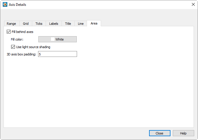
 The Area page has the following options, some of which may not be
available depending on plot type and, for Polar line plots, the selected
axis:
-
For Sketch, XY Line, and 2D Cartesian plots, you can adjust the size of the grid area by changing the extent of the viewport. (For these plot types, the viewport and grid area are synonymous.) Click thebutton to select a color using the color picker.
For 3D Cartesian and Polar Line plots, the grid area is adjusted by changing the axis range.
3D Cartesian Options:
-
Select this option to fill the area behind the axes (i.e., the grid area) with a specific color.
-
Select the color to fill the grid area in the color picker.
-
Select this option to apply light shading to the axis planes.
-
Minimum distance from input data to axis box. Reducing this value does not immediately affect the plot appearance, as existing axes still satisfy the new constraint; you can use "Reset Range" on the "Range" page toAxis Range Options for XY and 2D/3D Plotsforce the plot to redraw.
Polar Line options:
-
Select this option to fill the grid area with the specified color.
-
Select this option to fill the viewport area with the specified color.
-
Select the position of the viewport. The viewport is the percentage of the entire plot area occupied by the plot grid. Select the position of the left, right, top, and bottom borders of the grid area (expressed as a percentage of the entire plot area).
Time/Date format options
The dialog applies to all plot types, including Sketch. You can use this dialog to display axis labels in various formats, including time/date formats.The dialog can be accessed by going to.或Page,Specify Number FormatFor more information, see dialog.
You can also display elapsed time on any axis instead of absolute time. To do this, the raw time/date data in the data file must indicate elapsed time.)
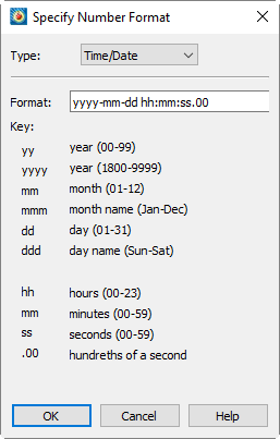
To specify axis labels using time/date format, select "Time/Date" from thedrop-down menu. Data is read forward from December 30, 1899. Tecplot 360 also accepts negative values to support dates back to January 1, 1800.
You can format labels by entering available time/date codes in the format field. When entering the format, you can use any combination or subset of time/date formulas.
| If "m" is used immediately after "h" or "hh", or immediately before "ss", Tecplot 360 will display minutes instead of months. |
Use the following formulas and table to enter time/date codes:
:
years-months-days hours:minutes:seconds:
| Time/Date code | Display format | |
|---|---|---|
Years |
yy |
00-99 |
yyyy |
1800-9999 |
|
Months 1 |
mmmmm |
First letter of the month |
m |
1-12 |
|
mm |
01-12 |
|
mmm |
Jan-Dec |
|
mmmm |
一月-十二月 |
|
Days |
[d] 2 |
Total elapsed days |
d |
1-31 |
|
dd |
01-31 |
|
ddd |
Sun-Sat |
|
dddd |
Sunday-Saturday |
|
ddddd |
Sun, Mon, Tue, Wed, Thu, Fri, Sat |
|
Hours 3 |
[h] |
Total elapsed hours |
h |
0-23 or 1-12 |
|
hh |
00-23 or 1-12 |
|
AM/PM |
AM or PM |
|
A/P |
AM or PM represented by "A" or "P" |
|
Minutes |
[m] |
Total elapsed minutes |
m |
0-59 |
|
mm |
00-59 |
|
Seconds |
s |
0-59 |
ss |
00-59 |
|
.0 |
Tenths |
|
.00 |
百分位 |
|
.000 |
千分位 |
1代码可输入大写或小写字母;但字母将按显示格式中所示显示。无法格式化为时间或日期的数字将显示为星号。
2已用天数、小时和分钟的总数适用于大于或等于零且小于或等于1,000,000天的时间值。
3如果在时间/日期格式中输入"AM/PM"或"A/P",则"h"和"hh"小时代码使用12小时制表示。否则,小时以24小时制(军用时间)表示。
|
在时间/日期公式中的y、m、d或s前加反斜杠,可防止其被作为公式的一部分处理。不属于时间/日期公式的所有字符将按输入原样显示。 例如,"\year yyyy"将显示为"year 2008",因为反斜杠阻止了第一个y被作为公式的一部分处理。 |
Examples
要在绘图中将时间和日期显示为"Sat-Jan-05-2008",请输入以下代码:
ddd-mmm-dd-yyyy
要在绘图中将时间日期显示为"1-3-08"格式,请输入以下代码:
m-d-yy
要在绘图中将时间日期显示为"9:30:05 AM"格式,请输入以下代码:
h:mm:ss AM
要显示经过时间(如"3:10:15"),请输入以下代码:
[d]:hh:mm
Microsoft Excel 支持
Tecplot 360 支持 Microsoft Excel(Mac Excel "1904"格式除外)的时间/日期数字字符串,但不支持 AM/PM 时间格式、长星期名称和长月份名称。此支持允许您在 Excel 中创建数字格式并将其导入 Tecplot 360 绘图使用,反之亦然。
| 时间/日期数字字符串可从 1900 年 3 月 1 日起从 Excel 传输至 Tecplot 360。 |
加载时间/日期数据
您可以像加载其他数据点一样,将时间/日期数据加载到 Tecplot 360 中。以下方法将时间/日期数据作为浮点数加载。(加载后,使用将坐标轴格式更改为时间/日期显示。)以下方法可用于将时间/日期数据加载到 Tecplot 360 中。
- Excel 宏(附加组件)
-
此附加组件提供更多从 Excel 加载数据的选项。虽然需要在 Excel 中安装,但安装后,此方法可实现从 Excel 到 Tecplot 360 的快速简便数据加载。详情请参阅Excel Add-In。
- 文本电子表格加载器
-
如需加载分隔文件,请使用此加载器。操作说明请参阅Text Spreadsheet Loader。此格式中包含的时间/日期数据必须使用 Excel 和 Tecplot 360 通用的浮点数表示。(有关此格式的更多信息,请参阅数据格式指南。)[xxxxxxxxxxxxxxxxx placeholder for data format guide]